Introduction
This blog discusses the importance of web typography in enhancing usability, aesthetics, and the user experience. It provides best practices for selecting and pairing fonts to create a cohesive brand identity.
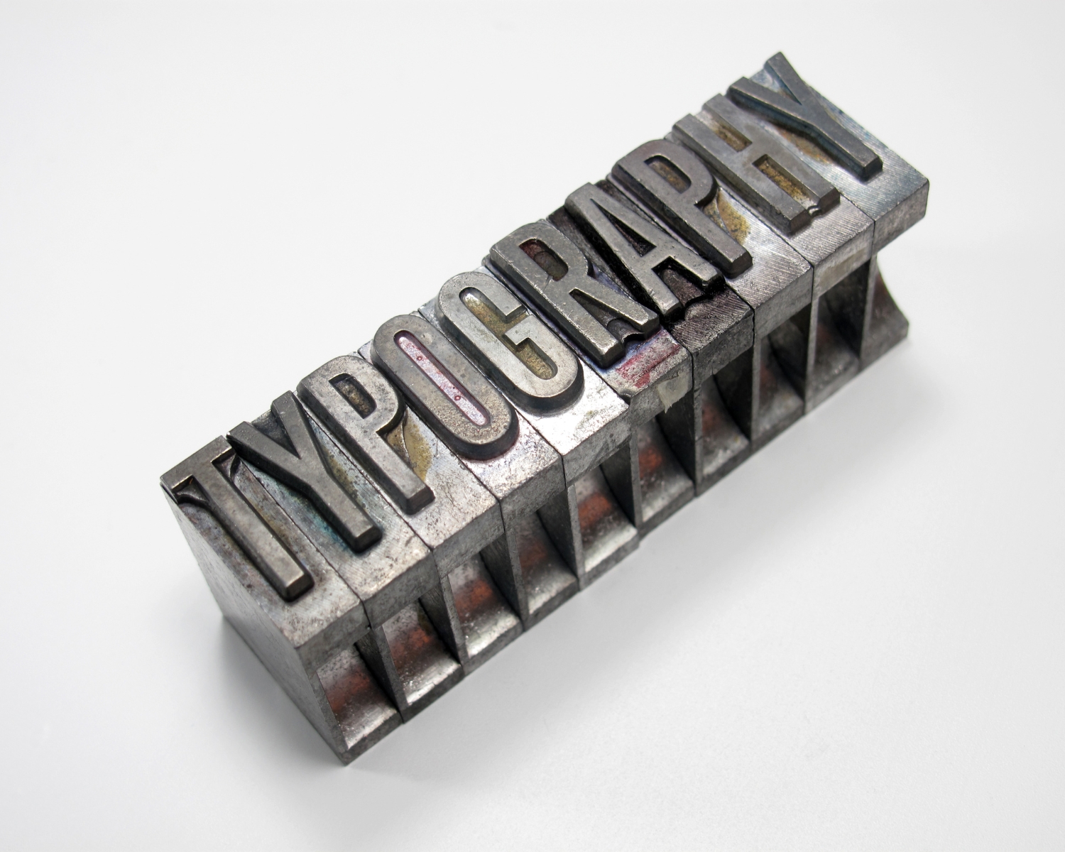
Understanding the Importance of Typography
Good typography guides a visitor through the content intuitively and engagingly. It helps to establish a visual hierarchy, emphasizes important elements, and plays a key role in the website’s navigability. Moreover, the fonts you choose can reflect the personality of your brand and communicate your message effectively.
Best Practices for Choosing Fonts
- Start with Legibility
Choose legible fonts like Arial, Verdana, and Helvetica for website text, as they are favored for their clarity and simplicity across various devices and screen resolutions. - Consider the Mood and Brand
Fonts, like Times New Roman or Georgia, are traditionally formal and suitable for law or academia, while sans-serif fonts are modern and clean, ideal for tech startups or lifestyle brands. - Limit Font Families
Using too many font families can make your website look cluttered and undermine your typographic hierarchy. As a general rule, stick to three font families: one for headings, one for body text, and perhaps another for accents or calls to action.
Best Practices for Pairing Fonts - Combine Complementary Styles
When pairing fonts, look for those that complement but contrast with each other. For instance, a serif font for headings can pair well with a sans-serif font for body text, providing both harmony and contrast. This contrast helps create a clear distinction between elements like titles and body content. - Ensure Visual Balance
The fonts you choose should balance each other visually. For example, if your heading font is bold or elaborate, consider something more subdued for your body text. The goal is to keep the reader’s focus on the content, not overwhelm them with competing styles. - Use Font Pairing Tools
If you’re unsure about how to pair fonts, several online tools can help, including Google Fonts, Font Pair, and Type Wolf. These resources provide examples of effective font pairings that you can use as a starting point. - Test Readability
Once you’ve selected and paired your fonts, test them across different devices, especially mobile. Check for readability, load times, and overall aesthetic. Feedback from real users can also be invaluable, so consider conducting user testing or A/B testing to see which fonts perform best. - Consider Context and Hierarchy
Use typography to create a hierarchy of information, with headings emphasized but not dominating the page and calls to action prominently displayed with a unique font or style.
Conclusion
Web typography is a combination of art and science, enhancing a website’s readability, usability, and aesthetic appeal. It aims to communicate your message, establish a clear hierarchy, and consider the audience’s experience.