Introduction
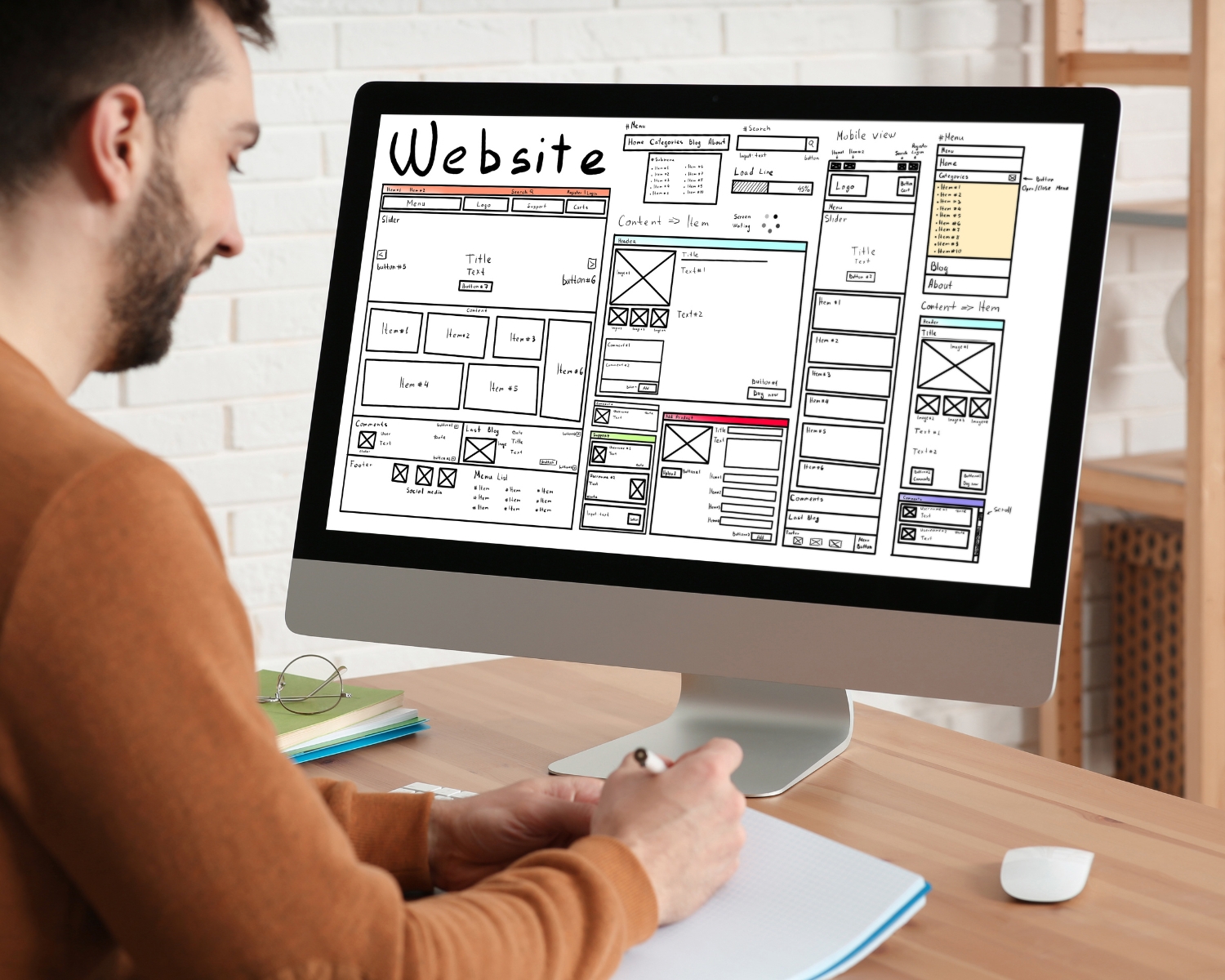
This blog discusses the importance of grid systems in web design, a fundamental structure that organizes content into a clean, balanced layout, originating from print design and popularized by Bootstrap frameworks.
Why Use Grid Systems in Web Design?
- Consistency and Harmony
Grids provide a consistent structure to a website, ensuring perfect alignment across pages, enhancing harmony, order, and a sense of aesthetically pleasingness and ease of navigation. - Improved Readability
Grids aid designers in enhancing readability by breaking space into manageable units, resulting in a better user experience by allowing easy scanning and comprehension of information. - Responsive Design
Grid systems adapt to screen sizes, ensuring website functionality and aesthetics on all devices, from desktops to smartphones, through responsive grid layouts. - Efficient Design Process
Grids offer a systematic method for placing elements, streamlining the design process, and reducing decision-making time, allowing designers to concentrate on creativity rather than layout challenges.
How to Use Grid Systems Effectively - Choose the Right Grid
The first step is selecting a grid system that suits the content and functionality of your website. The most common types are:
Column grids: Used for layouts divided into multiple vertical sections.
Modular grids: Combine columns with horizontal rows for more complex layouts.
Baseline grids: Focus on vertical spacing and are used primarily for typography alignment. - Define the Margins and Gutter
Margins and gutters are essential elements in creating “breathing room” around grid edges and columns, enhancing content legibility and aesthetic appeal. - Establish a Hierarchical Structure
Grids enhance visual hierarchy by arranging key elements in prominent grid sections, thereby guiding the viewer’s eye and thereby enhancing user engagement and design effectiveness. - Adapt Grids for Responsiveness
Ensure your grid adapts to different screen sizes by adjusting column numbers, gutters, and margins using tools like CSS Grid Layout and Flexbox for flexible and responsive grids. - Experiment with Overlapping Elements
While grids provide a guide, they don’t need to be restrictive. Overlapping elements on a grid can add depth and interest to your design. Experiment with layers, using grid lines as a guide to maintain alignment and balance. - Use Prototyping Tools
Utilize web design and prototyping tools that support grid systems, such as Adobe XD, Sketch, or Figma. These tools help visualize how the grid will look with actual content and allow you to adjust layouts easily.
Conclusion
Grid systems enhance web design functionality, aesthetics, and usability by providing a method for creating balanced, consistent, and responsive websites. Integrating grid systems into web design processes elevates the final product’s beauty and effectiveness.