Introduction
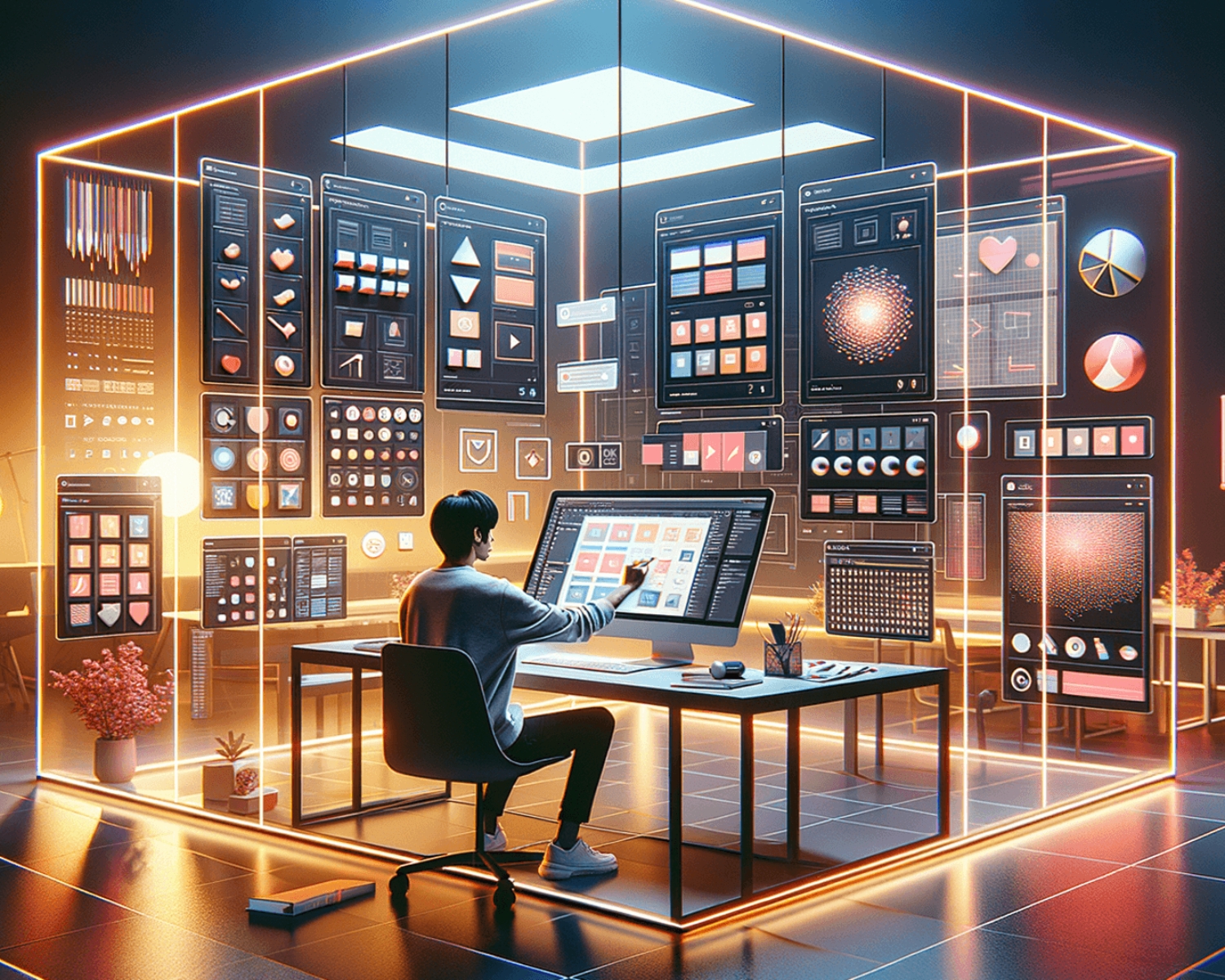
A well-structured design system can drastically improve product design consistency, efficiency, and collaboration. Whether you’re working solo or as part of a team, Figma’s design systems help streamline workflows by providing reusable components, typography styles, color palettes, and UI patterns.
If you want to speed up your workflow and create scalable designs, here’s how to effectively use design systems in Figma.
- What is a Design System in Figma?
A design system is a centralized library of UI components, styles, and design guidelines that ensure consistency across a product. In Figma, design systems function as shared components that multiple designers and teams can access and update in real time.
Why Use a Design System?
Maintains consistency across multiple screens and projects.
Reduces repetitive work by reusing elements instead of recreating them.
Improves collaboration by standardizing design rules across teams.
Speeds up prototyping with ready-made UI components. - Setting Up a Design System in Figma
Step 1: Create a Shared Library
Start a new Figma file dedicated to your design system.
Organize UI components, typography, colors, and icons in separate frames.
Enable “Team Library” in Figma to share components with your team.
Step 2: Define Styles for Consistency
Typography: Set up font styles for headings, subheadings, and body text.
Color Palette: Create a structured color system with primary, secondary, and accent colors.
Spacing & Grids: Define a grid system and spacing rules to ensure design alignment. - Building and Using Components Efficiently
Step 1: Convert UI Elements into Components
Turn common UI elements like buttons, input fields, and navigation bars into components so they can be reused.
Step 2: Use Variants for Flexibility
Figma’s Variants feature lets you group similar components (e.g., button states (default, hover, disabled) into one for easy swapping.
Step 3: Update Once, Apply Everywhere
When you edit a main component, all instances update automatically, saving time and ensuring design uniformity. - Leveraging Auto Layout for Responsive Design
Figma’s Auto Layout feature helps make components scalable and adaptable to different screen sizes.
Automatically adjust padding and spacing when resizing components.
Create responsive designs that adapt to content changes.
Eliminate manual alignment adjustments, improving efficiency. - Collaborating with Teams Using Design Systems
Enable Team Libraries to share design assets with your team.
Use Figma’s Comments to provide feedback and document changes.
Create Version Control by maintaining a master file and updating components centrally.
Conclusion
A well-structured design system in Figma optimizes workflows, improves collaboration, and ensures project consistency. By leveraging shared components, styles, and Auto Layout, designers can focus on creativity and problem-solving rather than repetitive tasks.
Start building your design system today and streamline your Figma workflow for maximum efficiency!
#Figma #DesignSystems #UIUX #WorkflowOptimization #FigmaTips